As well as planning ahead, you can check what happened in the past by viewing a chart of the historical heating data, on a zone-by-zone basis.
To view the chart for a zone:
- From the home page, click on the relevant zone
- Click on the zone sub-menu, followed by Zone Chart
| Info |
|---|
Hover/tap on the chart to see the temperatures for that time of the day. |
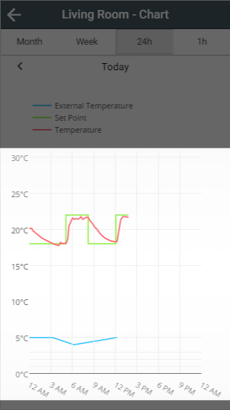
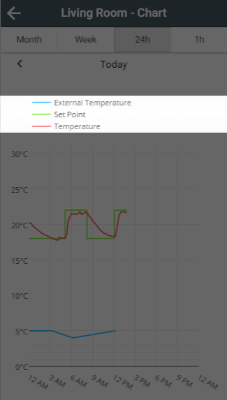
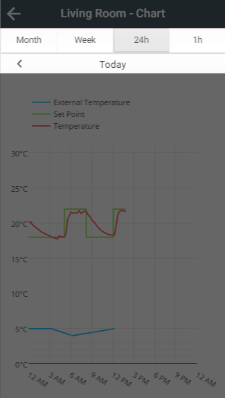
What is displayed on the charts
Depending on the type of zone, and the kit in the zone, the following can be shown:
- External Temperature: Shown as a blue line, with the temperature retrieved from weather data.
- Set Temperature: Shown as a green line, this is the temperature a zone is set to control to at any point.
- Measured Temperature: Shown as a red line, this is the temperature a zone used to determine whether to heat the room.
- Heating: Shown as orange shading, this shows whether a Underfloor, Hot Water Temperature or On/Off zone was 'On',
- Occupancy: Shown as a black bar, this shows when occupancy was detected in the zone.
| Anchor | ||||
|---|---|---|---|---|
|
The charts will show any available data when first loaded. If you do not want to see all of the lines on the charts, you can toggle these by clicking on each entry in the legend.
Navigating the charts
| Anchor | ||||
|---|---|---|---|---|
|
The charts load with a default view of 24 hours, from midnight to midnight. To change the view to a longer or shorter duration click on one of the 4 buttons at the top of the app, under the title bar.
| Note |
|---|
It may take some time to load and navigate in the monthly view as a lot of data will need to be collected from your Genius Hub |
Moving through time
Once you have selected the relevant duration, you can click on the left and right arrows underneath the duration buttons to move back and forward by the chosen interval.
To see how quickly your rooms heat up, or when a room is normally used, just click on the Zone chart from any zone's sub-menu.
Navigating the charts
There are 2 ways to change the view of the charts:
- The four buttons at the top of the page are used to adjust the zoom level of the charts, clicking on these will change how long is represented on the charts
- The left and right arrows under the zoom buttons are used to pan the chart back and forwards in time. The current time-range being displayed in shown in between these two navigation buttons.
<image of chart navigation, with (1) and (2) highlighted>
Reading the charts
The charts can show a lot of information, depending on which type of zone is being displayed. The x-axis scales dependent on the zoom level selected, and the y-axis scales dependent on the data being displayed.
<image of chart with example data>
- Measured temperature: The red line displays the temperature from any devices which feeds the measured temperature back to the app in the zone being displayed.
- Set temperature: The orange line shows the schedule of the zone. When the measured temperature is below the set temperature the heating will be called on to provide heat and when the red line is at/above the orange line the heating will switch off as the zone is at or above its target temperature.
- External temperature: This is provided by the weather forecast and is displayed in blue on each zone. This can be used to see how the external temperature affects how long the zone can take to warm up or cool down.
- Occupancy detected: Any detected occupancy for zones with a Room Sensor is displayed as a black bar chart along the x-axis
When viewing the chart for a zone, any of the above options can be hidden from view by clicking on the respective coloured dot next to the description of the data.
<image of chart with dots highlighted>