
As well as planning ahead, you can look back at what happened by viewing a chart of the historical heating data for each zone.
To view the chart for a zone:
-
From the My House page, click on the zone.
-
Click on the zone sub-menu, followed by 'Zone Chart'.
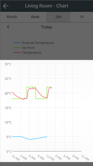
Hover over or click on the chart to see the temperatures at that time of day.
What is displayed on the charts
Depending on the type of zone and the devices in it, the chart can show:
-
External Temperature: Shown as a blue line, using the outside temperature from weather data.
-
Set Temperature: Shown as a green line. This is the temperature the zone was set to control to at each point.
-
Measured Temperature: Shown as a red line. This is the temperature the zone used to decide whether to heat.
-
Heating: Shown as orange shading. This shows when an Underfloor, Hot Water Temperature or On/Off zone was 'On'. It is not shown for Radiator zones.
-
Occupancy: Shown as a black bar. This shows when occupancy was detected in the zone.
Changing what is displayed on the charts
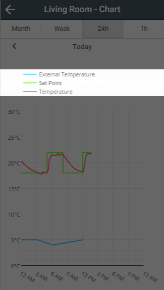
When the chart first loads, it shows all the available data. To hide or show a line, click on its entry in the legend.
Navigating the charts
Selecting a duration
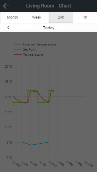
The chart opens showing 24 hours, from midnight to midnight. To change the time span, click on one of the 4 buttons at the top of the page, under the title bar: Month, Week, 24h or 1h.
The Month view may take some time to load and navigate, as a lot of data needs to be collected from your Genius Hub.
Moving through time
Once you have selected a duration, click on the left and right arrows underneath the duration buttons to move backwards and forwards by that amount.